About this exhibition
Join to take in an exhibition of music posters by Scrojo, with anecdotes and stories that dive into the inspiration and history behind each design. A San Diego native, Scrojo created many of his posters for the iconic Belly Up Tavern in Solana Beach, where he has been the resident artist for 30 years, beginning at the age of 19.
Retrospective Works by Scrojo
Craig “Scrojo” Haskett, born in Oceanside CA, is a talented poster artist, illustrator and graphic designer who has been prolifically creating great work now for over 30 years. Scrojo and I worked together in 1993 on a print magazine called Music 619 ~ a mag celebrating the growing “San Diego music scene” that featured many of the ripping bands that deserved recognition, during the famed early nineties “Seattle scene”. Back in the eighties, Scrojo cut his illustrative design teeth while working at the iconic Del Mar Pannikin, creating all the great chalkboard menu art, along with t-shirt graphics, that help create the vibe for all the local skateboarders (including myself) to gather after sessions and drink way too much coffee. Since then, Scrojo has designed t-shirts, logos, skateboard decks and ads for several cafes, skateboard and surf companies, as well as for many big brands such as Nike, Disney, Fender Guitars, House of Marley, the SD Zoo and more.
I’ve especially been amazed at the enormous set of radical concert posters Scrojo has created that proudly hang in the infamous Belly Up Tavern in Solana Beach. If you haven’t seen a show and Scrojo’s posters at the Belly Up yet, you’re blowing it! Craig has also done design work for legendary music venues such as The Fillmore in SF, The Casbah, The Troubadour in LA and House of Blues. Some of Scrojo’s posters have made cameos on various popular television shows and documentaries.
You can pick up some of Scrojo’s signed, limited edition silkscreens and other posters on scrojo.com
- Mike Nelson of Type G Branding
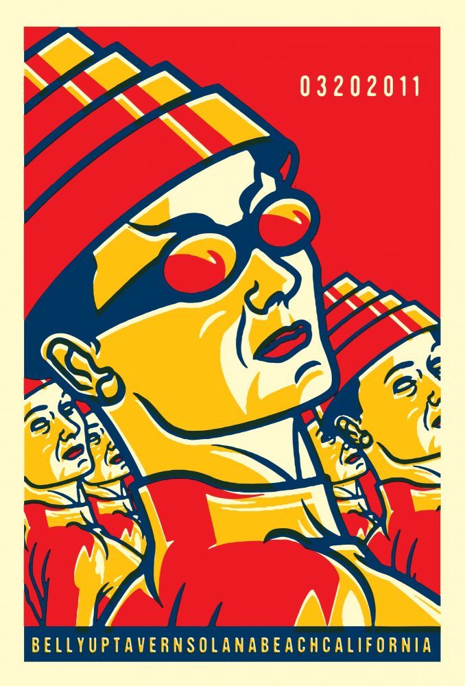
Devo | Belly Up Solana Beach, 2011
A personal favorite of mine from the Belly Up Solana Beach series because:
A): nowhere on the poster does it actually say “Devo”.
B): I love the band.
C): I’ve come to develop a bizarre history with the band over a similar design.
I started doing work for the Belly Up at the age of 19, before I could legally get into the club. At the time I was working at the Pannikin in Del Mar, a hangout for local band borracho-y-loco. Band manager Chris Goldsmith noticed some drawings in my sketchbook and asked me to make a poster for a gig at the Belly Up. The response to the poster was good and caught the attention of the venue’s promotions department. They commissioned me to come in and work on another poster. This was in the very early days of digital desktop publishing (knowledge of which I didn’t have at the time) so most posters were still being designed cut & paste manually. The club had a complete cut & paste production area put together so after I finished the poster I was hired to do, I continued showing up and working in the offices. As a poster was needed I did it, or I worked on other projects and commissions that began to come in. I was never officially hired at the Belly Up nor have I ever been an employee. I was just that weird kid that kept showing up and making crazy posters. After a while I was affectionately given the title “artboy” and given a monthly “allowance."
Through the 90s my involvement with the Belly Up fluctuated. Because of both physical changes to the office space and personality conflicts I was on again off again. I was moved from promotions to talent buying then back again with stints working in the attic and briefly out of a broom closet. It was at this time though that Dave Hodges, the original owner of the venue, gave me phenomenal freedom in poster content. This became my training through trial and error... and there were some pretty massive visual trainwrecks, the worst of which culminated in an act threatening not to go on stage because they thought I was intentionally trying to make them look bad.
Night Marchers | Lou’s Records
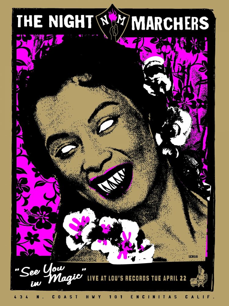
San Diego was fortunate enough to have an amazing music scene in the 90s, with its epicenter being The Casbah with links to most of the local independent coffee houses who employed a crap-load of band members. These were the kumbaya days with bands supporting/promoting each other and lots of creative cross-pollination. Without a doubt Rocket from the Crypt, led by John Reis, was the most successful of the groups during this time. I never got a chance to design a poster for RFTC but I did design the insert on their second single, “Yum Kipperd”. I was hanging out with Jonny Donhowe from Olivelawn/fluf as he was laying out the packaging for the single, and it was his idea to add a last-minute illustration. The Night Marchers are one of Reis’s post-RFTC bands.
Misfits | House Of Blues San Diego
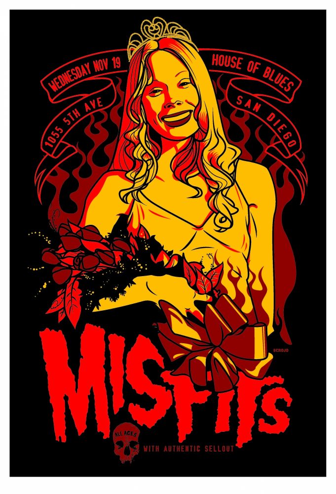
I’m a big fan of the misfits and think this view from Carrie, the moment before all hell breaks loose, works nicely with their classic horror.
House of Blues San Diego was a strange one for me at first. A few of the Belly Up crew who I was really close with had gone to work there at about the same time the Belly Up was changing owners. When I was asked to do posters for HoB I had a minor crisis in loyalty. Fortunately it wasn’t an issue for either party. San Diego has actually had amazingly amicable relationships between its more successful music venues. Great evidence of this is the symbiotic relationship with the Belly Up and Casbah cross-promoting productions.
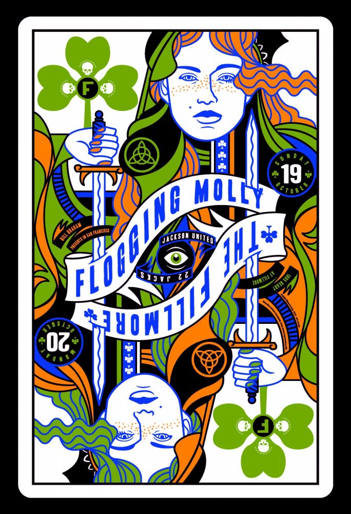
Flogging Molly | The Fillmore San Francisco
I’ve been friends with Matt Hensley, accordion player for the SoCal based Flogging Molly, since before he joined the band. Matt’s an interesting character. Whenever something peaks his interest he will study it to the nth degree until he’s become a world-class master. I’ve seen him do it with skateboarding (He’s a hall of fame skater), accordion, pool, and poker. The latter happened as the band was touring. The countless dead hours on the tour bus led to the band playing poker, which led to them obsessively reading books and watching videos breaking down every minor aspect and strategy involved in the game. When The Fillmore approached me to do a poster for the band, the direction seemed like a no-brainer. I penciled up the playing card concept, submitted it to BGP/Fillmore and... it got rejected for “having nothing to do with the band." I was eventually able to plead my case and get The Fillmore to reverse their decision - the only time that’s happened in the 15 years I’ve worked with the venue.
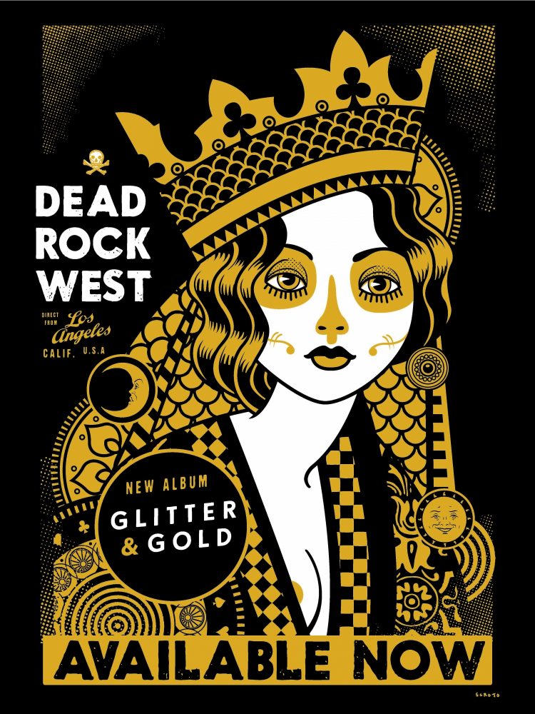
Dead Rock West | album promo poster
I’d been doing work for SoCal’s Dead Rock West for a couple years when founding member Frankie Lee Drennen approached me about working together on an upcoming album/CD packaging project. Frank came to the studio, and we proceeded to have an afternoon brainstorm geekfest. The title “Glitter and Gold” had already been set so we decided to go for full-force metallic overkill. We were going to print everything on metallic paper using metallic inks: LP, CD, inserts and promo all shiny on shiny. No mercy whatsoever. Our initial production research looked positive, and it seemed like our idea was going to come to fruition, then budget concerns crept in and slowly things fell apart. We had to cancel the LP, and we had to nix the metallic paper for the CD. As the first printing was about to hit the press, the decision was made that the gold metallic ink was outside of the budget so it was switched to...pink. So, the first printing of “Glitter and Gold” makes no reference to glitter or gold (We were able to print on metallics on the promo poster, and gold was added to the second printing).
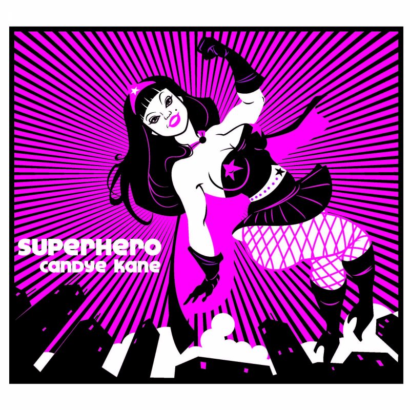
Candye Kane | Superhero
I’m pretty confident that Candye despised me the first time we met. The particulars are lost in a drunken haze, but I can remember intentionally aggravating her at a mutual friend’s party. Fortunately, Candye met a lot of people from her time on the road and didn’t have the greatest memory so...over the years and traveling in the same circles, we gravitated towards each other and developed a great working relationship and friendship. “Superhero” is my personal favorite of the work that I did for Candye but I believe her choice was the cover to “White Trash Girl”, which won the 2006 OUT Music award for Best Album Cover Design.
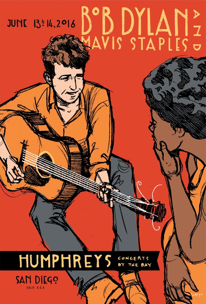
Bob Dylan and Mavis Staples | Humphreys
Humphreys commissioned me to make a poster for this gig from the legendary musician. I was working up some concepts for the design when I got a message from my business manager. Doing a little research, he learned that Dylan and Staples had a romantic relationship early in their careers. Doing some online image digging, we were able to find a photo of a young Dylan playing on a front porch, and in the yard are several people casually watching him. Among them is Mavis. The attraction between Dylan and Staples is obvious from the photo. The layout was awkward and wouldn’t work for a poster, so I did a couple quick pencil sketches of the two so I could play around with different placing. My manager liked the rough aesthetic of the pencil drafts, so we decided to just run with them.
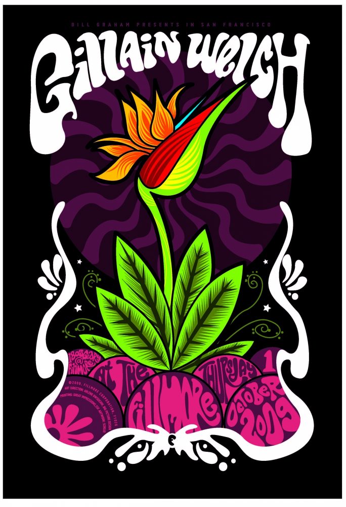
Gillian Welch | The Fillmore
The Fillmore can be a difficult one to come up with concepts for. There’s a list of things that can not be on a Fillmore poster (guns, smoking, etc), including no portrait of the artist or band. They are also hesitant to use anything that has imagery similar to anything they’ve done in the past. Since The Fillmore archive has hundreds of posters going back decades this can severely limit the potential image possibilities.
When they approached me about doing a Gillian Welch poster, I submitted four concepts based on “O Brother, Where Art Thou” since Welch’s music is featured in the movie, and she has a brief cameo. They rejected that direction. I did another round of concepts, which also got rejected. By the third round of concepts, I was pretty confident that I’d be dropped from the project, so I just knocked out some quickie folk art stuff. They didn’t like the general concepts but did like the element of a small flower I had in one. It was a bird of paradise, which had nothing to do with Welch, but at that point I didn’t care. I finished it off quickly and sent it to the printer before they changed their mind. To my surprise the poster was well-received.
Years later I was contacted by a horror film producer wanting to buy the rights to the art (sans Welch’s name) for use of the art as a t-shirt print for the lead character. I thought it was a weird choice and pushed for something else from my catalog, or to custom design a new flower to better fit a t-shirt format. He turned down the offer and was very insistent that it had to be that design.
Have a great question? Submit questions directly to SDDW presenters here!
About Scrojo
Scrojo is an illustrator/designer with over 3,000 concert posters designed to date. Scrojo has worked with the Belly Up, as well as The Fillmore (San Francisco), The Troubadour (Los Angeles), House of Blues, and The Casbah. He has designed posters for acts across all genres of music including The Rolling Stones, Bob Dylan, Foo Fighters, Lady Gaga, The Flaming Lips, Jane’s Addiction, The Pixies, Devo, Blondie, Snoop Dogg, Patti Smith, Willie Nelson, and more.
